
The Klavika Series
Sans serifs for the 21st-century





About
The Klavika series, designed by Eric Olson, consists of three typefaces published by the Process Type Foundry. The original design, Klavika, debuted in 2004 and was expanded four years later with the release of Klavika Condensed. In 2012, Klavika Display introduced four new weights in two widths. All in, the series has 24 styles and covers a wide range of uses providing an undoubtably modern tone for print and screens.
The Series
Klavika
A full-featured, do-it-all sans serif for the needs of the 21st-century. In attempt to make something versatile and modern, the design is unadorned and infinitely flexible. To achieve this, Klavika is a typographic hybrid – crossing humanist and geometric influences with allegiances to neither.
Klavika Condensed
Klavika Condensed is a narrow companion that doesn’t sacrifice the feel and functionality of the original. The near vertical terminations, straight sides, dynamic italic, and range of weights from Klavika, are right at home in this width.
Klavika Display
From extra stuffed to skeletal thin, Klavika Display is intended for really large sizes. The four weights — and two widths — bookend the rest of the series, making it a headline companion but also a set of boastful display fonts in their own right.
Features
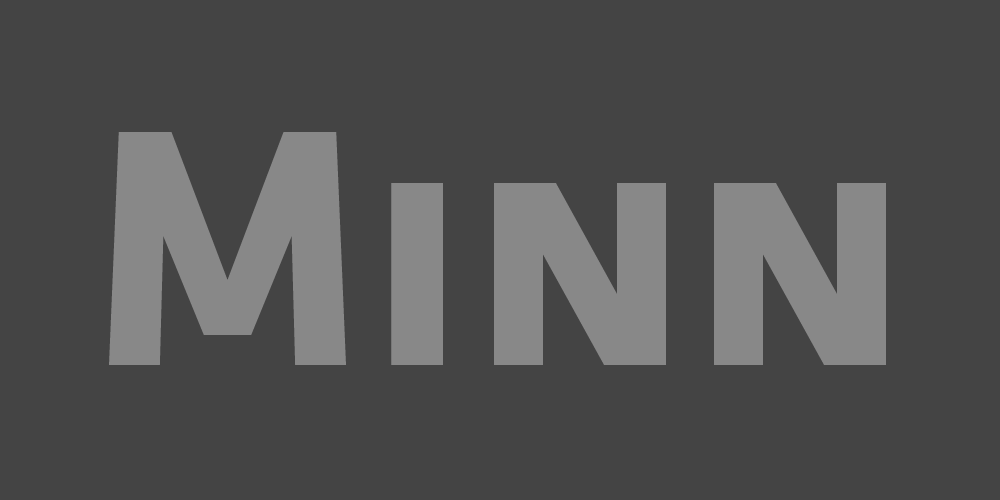
Small Caps
Klavika has true Small Caps and OpenType All Small Caps, featuring slightly wider characters for better legibility and added punch.
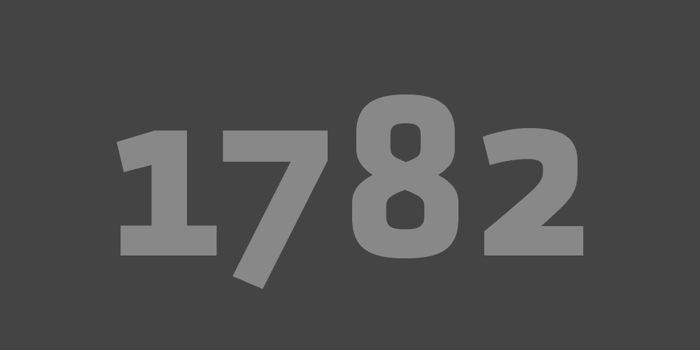
Numerals
Fit for contemporary communication, Klavika contains multiple numeral styles: Lining, Old Style, Small Caps and a Tabular version for each.
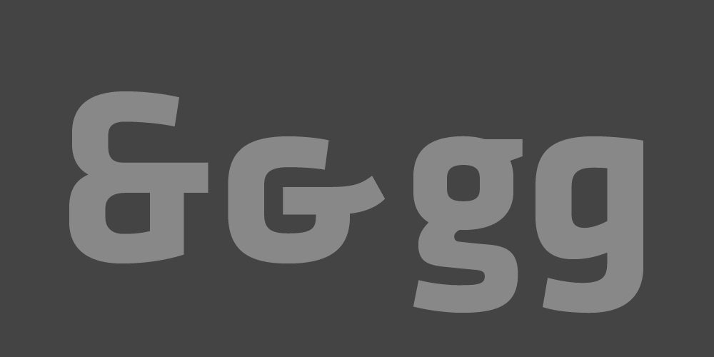
Alternates
The three typefaces in the series have OpenType Stylistic Alternates for the ampersand and single-story lowercase g.
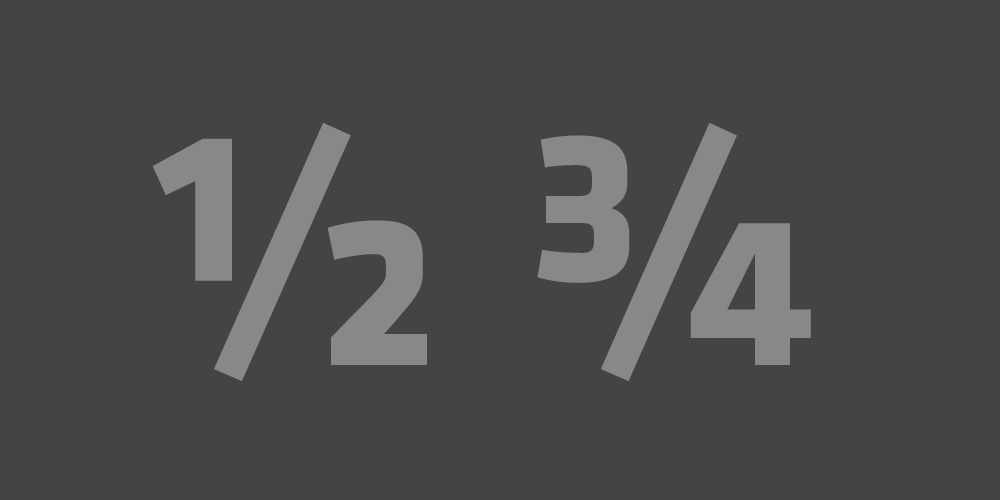
Fractions
Klavika includes pre-built fractions along with ordinals, superscripts, and mathematical symbols.
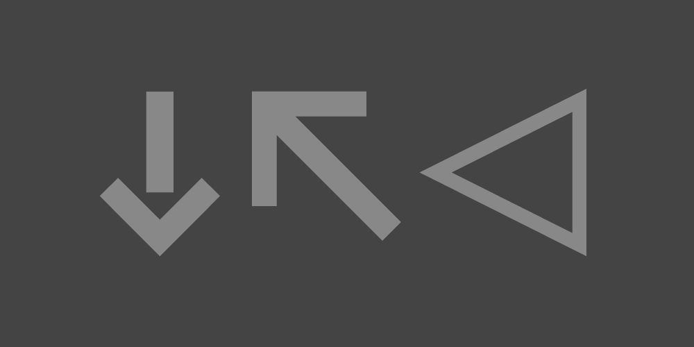
Ornaments
All of the typefaces have sets of arrows, found as OpenType Ornaments, and Klavika contains many additional shapes.
Details
Formats
Desktop: OTF (OpenType). Webfonts: WOFF & WOFF2 (Web Open Font Format) and EOT (Embedded OpenType).
Languages
Each typeface in the series includes our Extended Latin character set. View the complete list of languages this covers.
Italics
Klavika & Klavika Condensed have true italic styles. These dynamic designs match each weight in the families.
Rendering
Tuned specifically for the web, the webfont adjustments include manual hinting and minor character modifications.
Basic vs. Pro
We offer a Basic version of Klavika with a smaller character set and lower cost. The webfonts are only offered as Basic.
Try It or Rent It
You can try Klavika at Fontstand, a Mac application that allows for free one-hour trials and monthly rents.